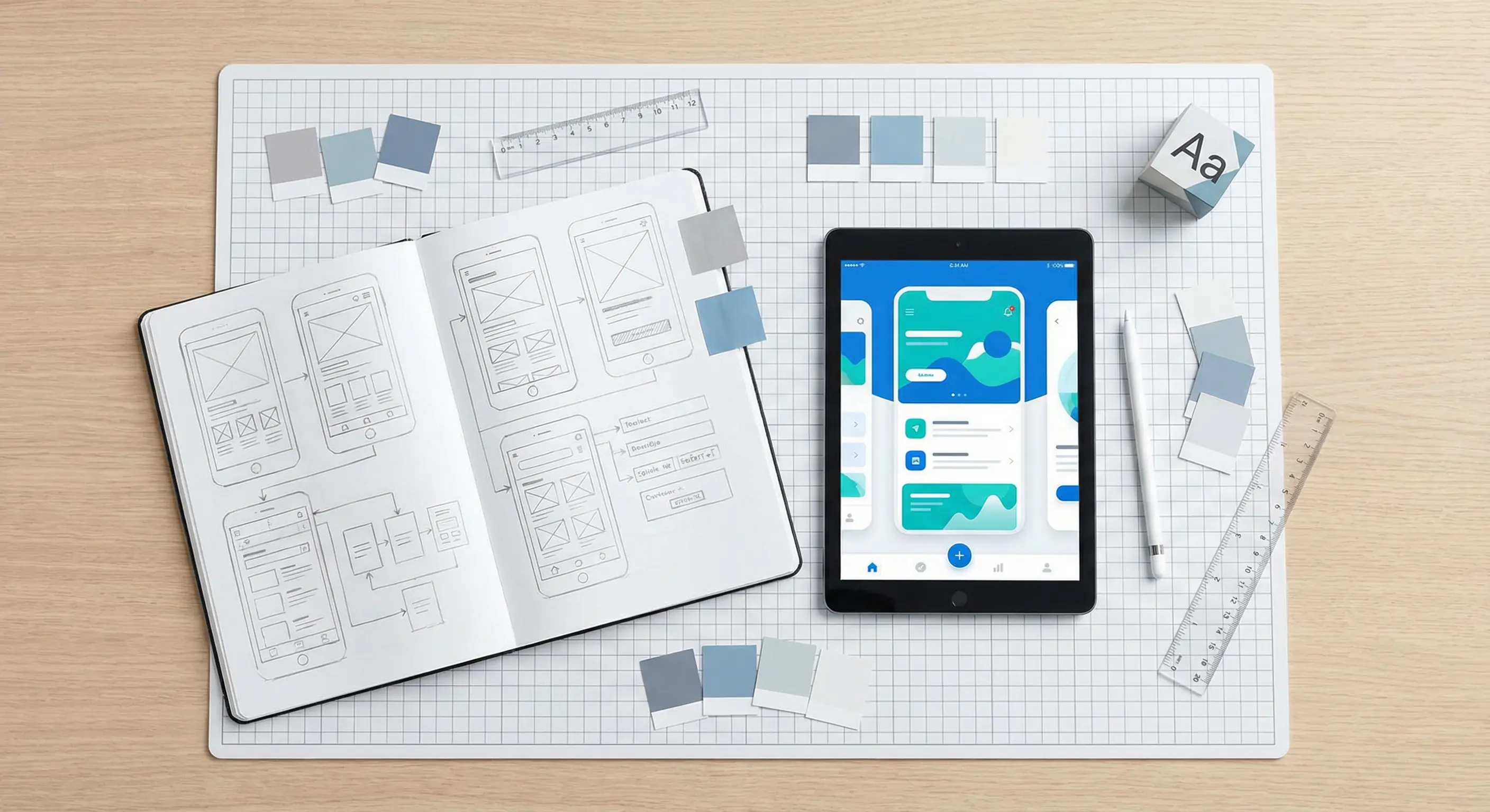
I used to think my job ended when the code compiled. But if users can't figure out how to use the app, the code doesn't matter. You don't need to be a professional designer to build decent interfaces. You just need to understand a few core principles. This guide covers the practical UI/UX concepts I use to make my front-end projects actually usable.
UI vs. UX: A Quick Clarification
Think of it this way: UI (User Interface) is the shovel; UX (User Experience) is how it feels to dig. UI is the buttons, layouts, and colors. UX is the flow and the feeling. You can have a beautiful app (good UI) that is a nightmare to navigate (bad UX). As a developer, you need to care about both. It’s the difference between a user sticking around or closing the tab in frustration.

Table of Contents
Nielsen's 10 Usability Heuristics
Jakob Nielsen gave us 10 "heuristics"—broad rules of thumb for interaction design. They aren't strict laws, but they are excellent defaults when you're stuck.
- Visibility of system status: Don't keep users guessing. If something is loading, show a spinner. If a form submitted, show a success message.
- Match between system and the real world: Speak the user's language, not "system-ese". Use words and concepts they already know.
- User control and freedom: Give users an "emergency exit". If they click something by mistake, let them undo or go back easily.
- Consistency and standards: Don't be different just to be different. Users shouldn't have to wonder if a different button style means a different action.
- Error prevention: A good error message is nice, but preventing the error in the first place is better. Design forms that are hard to mess up.
- Recognition rather than recall: Don't make users remember things from one screen to another. Keep information visible.
- Flexibility and efficiency of use: Make it easy for new users, but fast for power users. Keyboard shortcuts are a great example.
- Aesthetic and minimalist design: Remove the clutter. If an element doesn't serve a purpose, get rid of it. Less is more.
- Help users recognize, diagnose, and recover from errors: Error messages should be plain English, not error codes. Tell them exactly what went wrong and how to fix it.
- Help and documentation: Ideally, the app explains itself. But if not, make help documentation easy to find and search.
Core Design Laws for Developers
Beyond heuristics, there are a few "laws" that directly inform how you should code your UI.
Fitts's Law
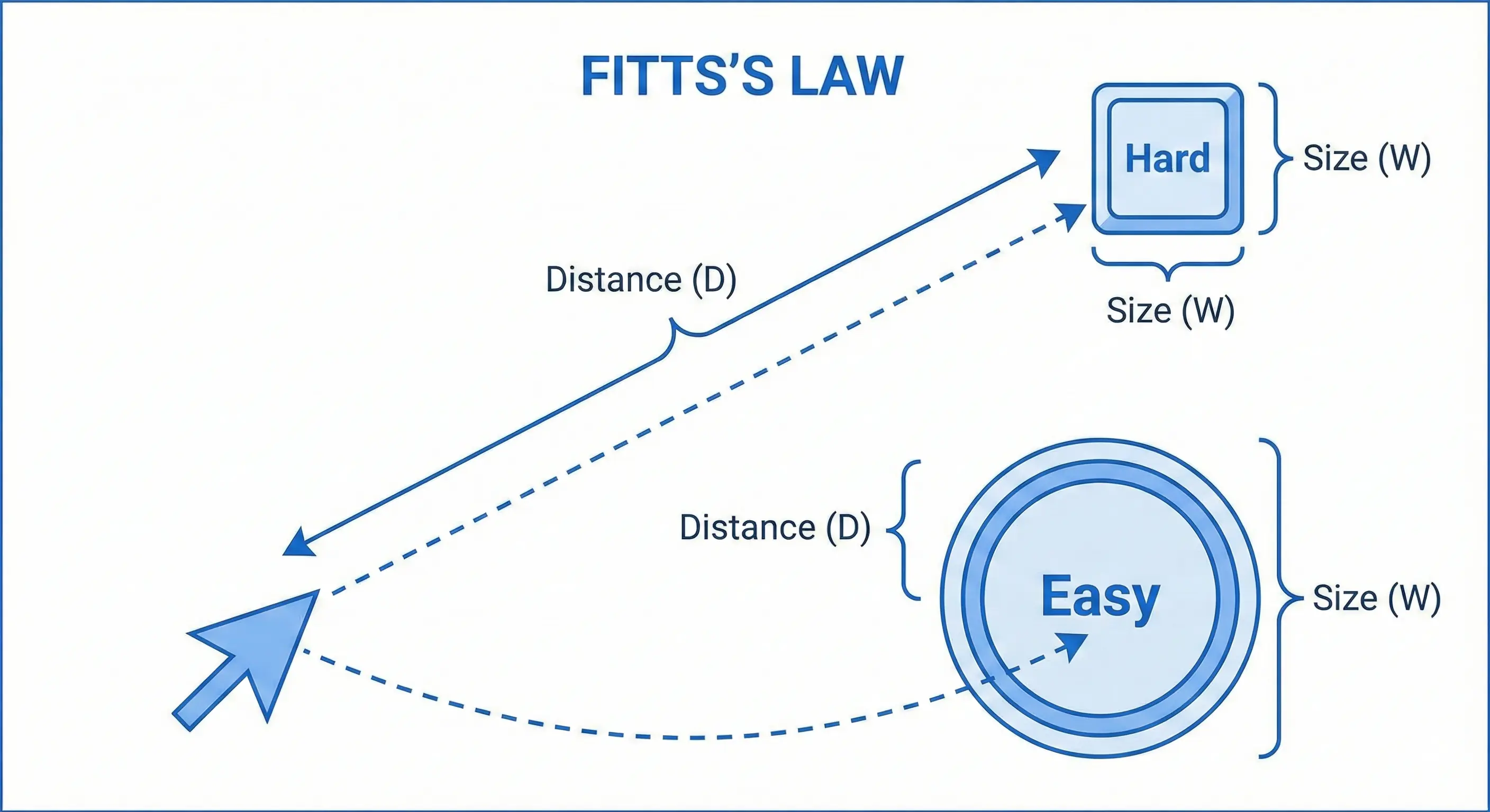
The Law: The time to acquire a target is a function of the distance to and size of the target.
Translation: Make buttons big enough to click easily, especially on mobile. Put related actions (like "Save" and "Cancel") close to the form they affect, not hidden in a corner.
Hick's Law
The Law: The time it takes to make a decision increases with the number and complexity of choices.
Translation: Don't overwhelm the user. If a menu has 20 items, group them. If a form is long, break it into steps. Reduce the cognitive load.
Jakob's Law
The Law: Users spend most of their time on other sites. This means they prefer your site to work the same way as all the other sites they already know.
Translation: Don't reinvent the wheel. A shopping cart goes in the top right. The logo goes in the top left. Stick to standard patterns so users don't have to relearn how to browse the web just for your site.
Visual Design Principles
You don't need to be an artist to make an interface look good. You just need to follow a few rules.
Visual Hierarchy
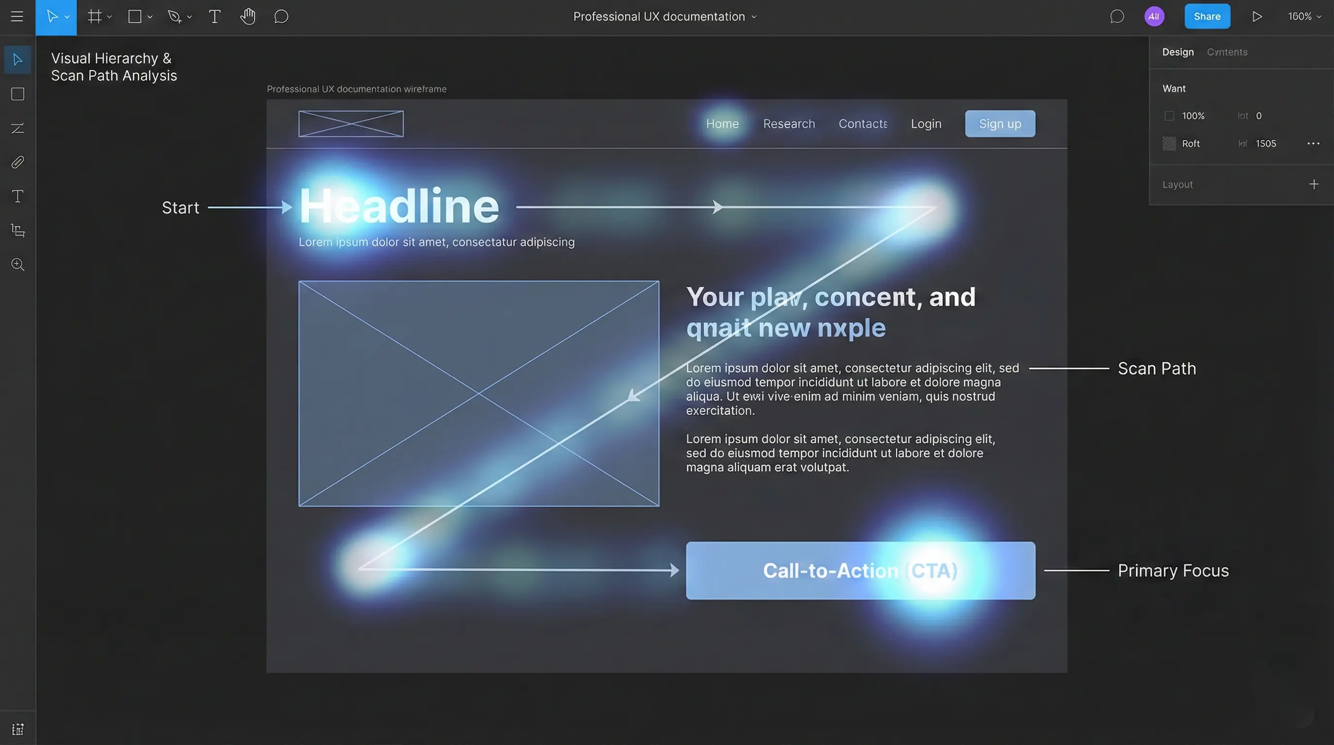
Visual hierarchy is about guiding the user's eye. You want them to see the most important stuff first. Use size, color, and position to signal importance. A big, bold heading says "Look here first". A muted gray caption says "This is secondary".
Color Theory for Developers
Struggling with colors? Stick to the 60-30-10 Rule:
- 60% Primary: A neutral color (white, gray, beige) for backgrounds.
- 30% Secondary: Your brand color for headers or cards.
- 10% Accent: A bold color for buttons and links (Calls to Action).

Also, always check contrast ratios. If people can't read the text, the color doesn't matter.
Typography Matters
Keep it simple. Use one font for headings and one for body text. That's it. Make sure your line height is breathable—usually 1.5x the font size. Cramped text is hard to read.
Whitespace (Negative Space)
Whitespace isn't empty space; it's active design. It separates groups and makes the content readable. Don't be afraid of gaps. Clutter is the enemy of good UI.
Practical Application & Modern Concepts
Mobile-First Design
Don't design for desktop and then squash it down. Start with the mobile view. It forces you to decide what is truly essential because you don't have room for fluff. Scaling up is easier than scaling down.
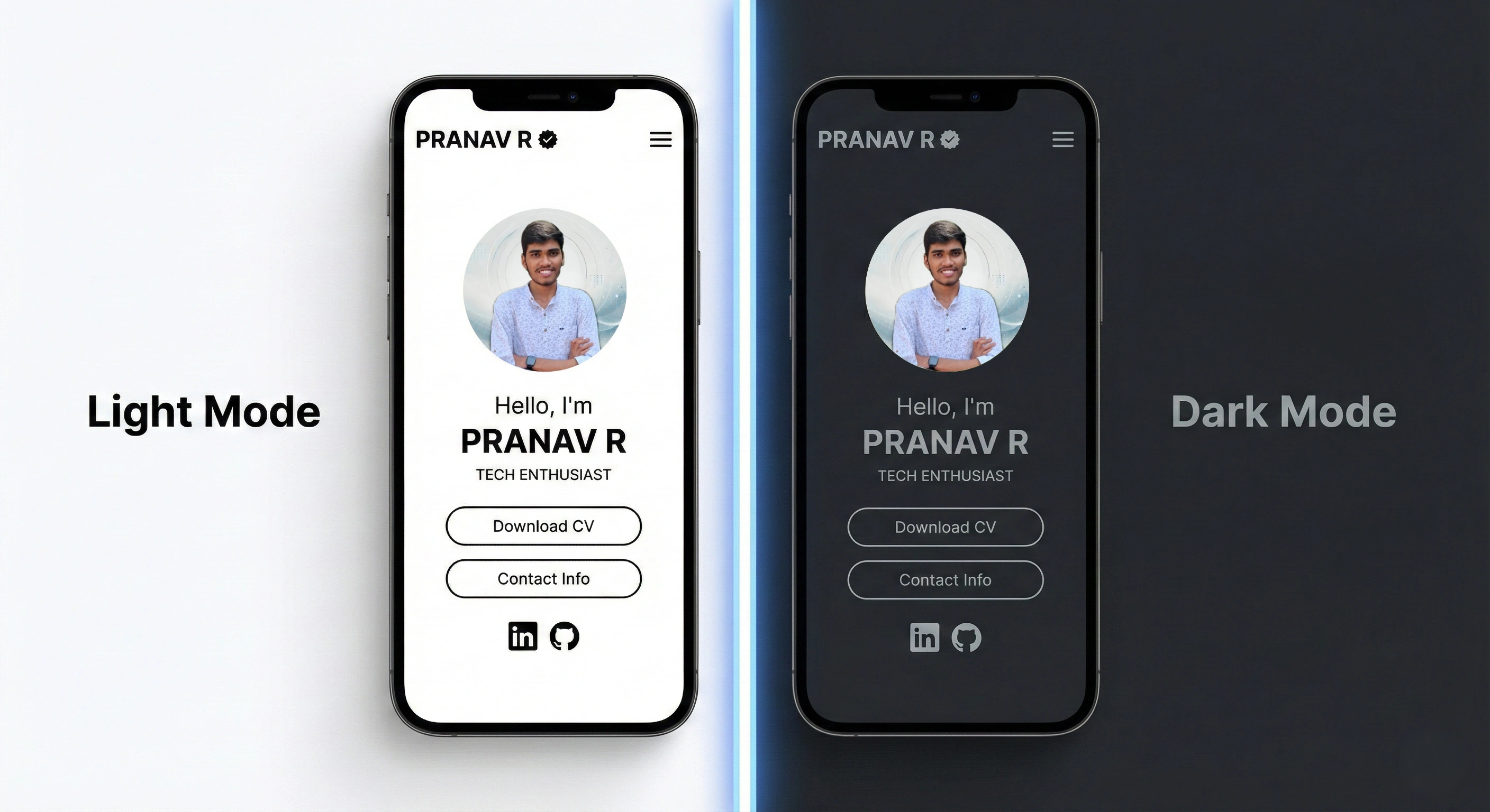
Designing for Dark Mode
Dark mode isn't just inverting colors. It requires specific adjustments:
- Avoid Pure Black: Use dark gray (e.g.,
#121212). Pure black causes eye strain and smearing on OLEDs. - Desaturate Colors: Bright colors vibrate on dark backgrounds. Mute them slightly.
- Use Depth: In light mode, we use shadows. In dark mode, use lighter shades of gray to show elevation.
Accessibility (A11y)
Accessibility (A11y) isn't an "extra feature". It's a requirement.
- Semantic HTML: Use
<button>, not<div>. The browser handles the heavy lifting for you. - Alt Text: Describe your images so screen readers can explain them.
- Keyboard Nav: Can you use your app without a mouse? If not, it's broken.
Conclusion
You don't need a design degree to build great software. By following these principles—clarity, consistency, and empathy—you can build interfaces that users actually enjoy. Start small, test often, and always put the user first.
Further Learning
To dive deeper, explore tools like Figma for prototyping, read articles from the Nielsen Norman Group, or study the official WCAG guidelines. Check out my Personal Portfolio project for a practical example!
Have questions about UI/UX design? Reach out via the contact form below or explore my other blog posts for additional insights!
Disclaimer: This article was written and edited by Pranav R. AI tools were used for assistance with drafting and visual assets.

