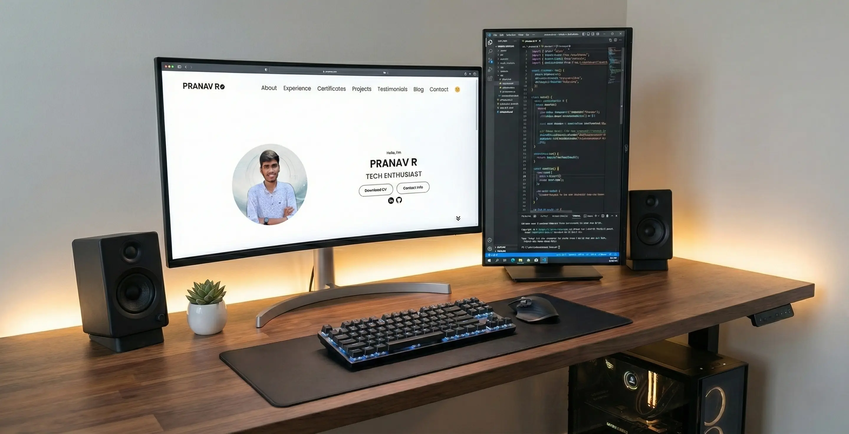
Project Overview
This portfolio is more than just a collection of links; it's a living project that demonstrates my commitment to clean code, responsive design, and a great user experience. Built from the ground up using only fundamental web technologies—HTML, CSS, and JavaScript—it serves as a practical showcase of my skills. The goal was to create a fast, accessible, and aesthetically pleasing platform to host my professional journey, without relying on heavy frameworks like Bootstrap or React.
Design Philosophy
The design is guided by a "content-first" principle. The layout is clean and minimalist, using a consistent color palette and generous whitespace to ensure that the projects and information are the main focus. The user interface is designed to be intuitive, with clear navigation and predictable interactions, adhering to Jakob's Law of UX—users prefer sites that work the same way as all the other sites they already know.
Key Features
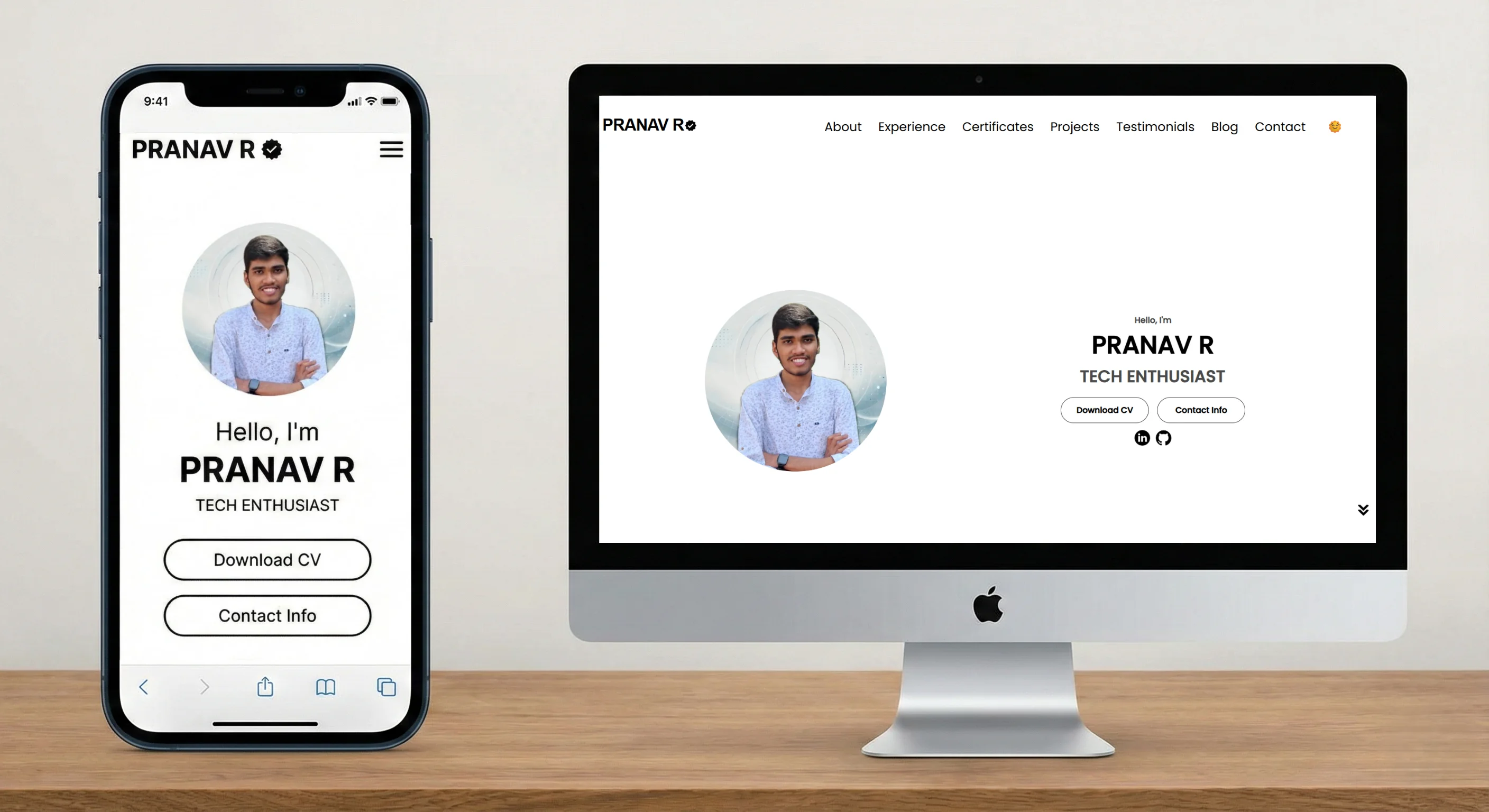
- Fully Responsive Design: The site was built with a mobile-first approach, ensuring a seamless experience on any device. Using CSS media queries, the layout fluidly adapts from a single-column view on phones to a multi-column grid on desktops.
- Persistent Dark Mode: A user-friendly theme toggle allows switching between light, dark, and system-default themes. The user's preference is saved in
localStorage, so their choice is remembered on their next visit. - High-Level Accessibility (A11y): Accessibility was a primary concern. The site uses semantic HTML5 tags (
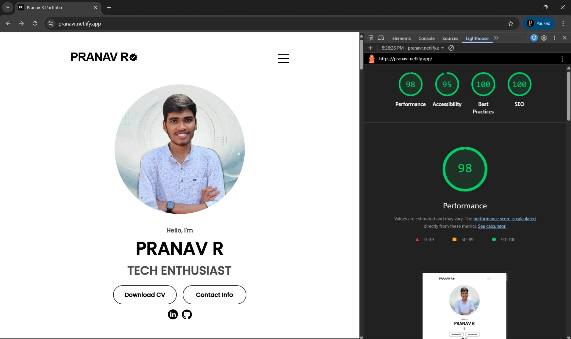
<main>,<nav>,<article>), ARIA (Accessible Rich Internet Applications) labels for icons and buttons, and ensures all interactive elements are keyboard-navigable with visible focus states. - Performance Optimized: To ensure fast load times, all images are converted to the modern WebP format and lazy-loaded. CSS and JavaScript are clean and efficient, resulting in a Lighthouse performance score consistently above 90.
Technical Deep Dive
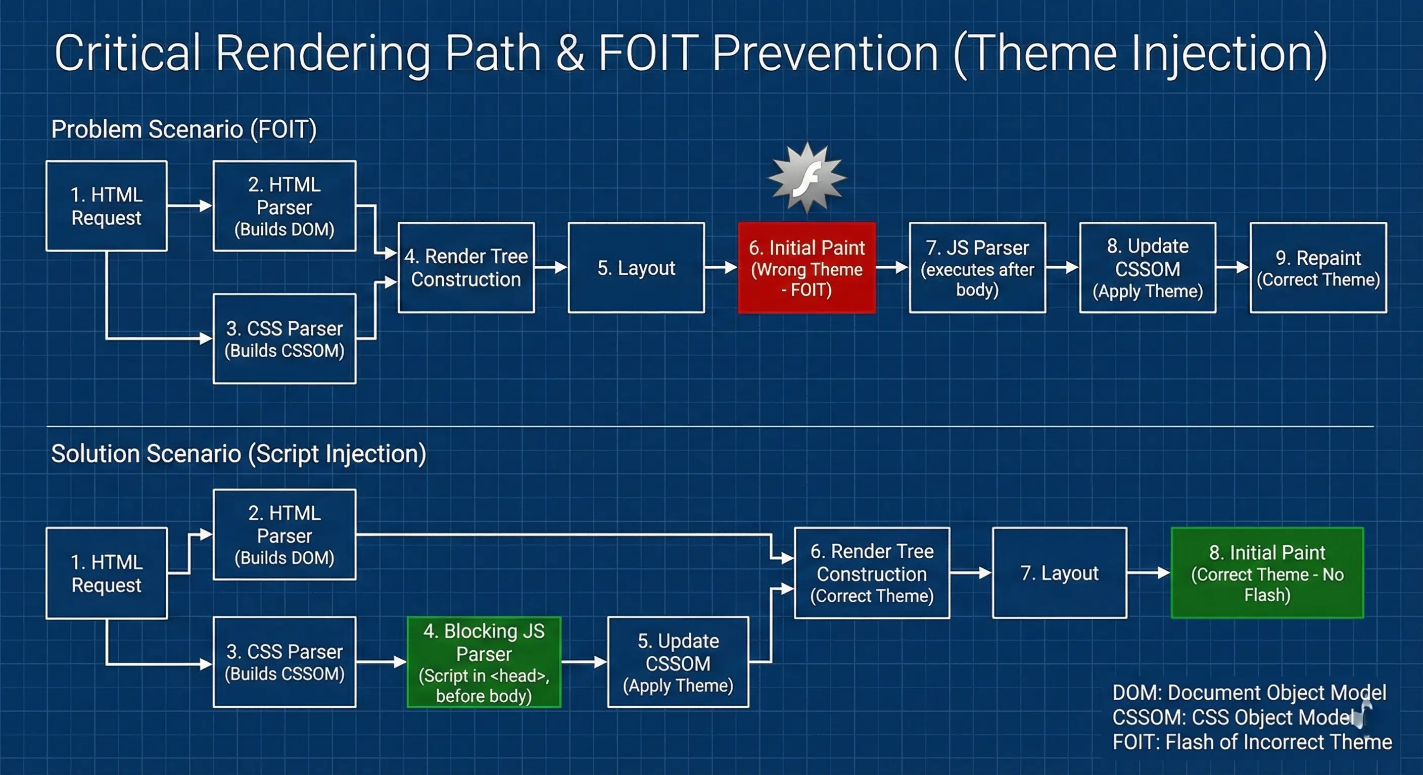
One of the most interesting challenges was implementing the theme toggle to prevent the "flash of incorrect theme" (FOIT) on page load. If the script runs after the body, a user with dark mode enabled might briefly see the light theme before it switches. This was solved by placing a minimal, blocking JavaScript snippet in the HTML s <head>. This script checks localStorage and applies the 'dark-theme' class to the body *before* the page is rendered, ensuring a seamless experience.
To understand why this works, it helps to visualize the browser's rendering process. By intervening before the Paint stage, we prevent the screen from flickering white.
The smooth scrolling behavior is achieved with the CSS property scroll-behavior: smooth;, enhanced by JavaScript to handle hamburger menu closures and accurate section targeting. All interactive elements, like the "More options" menus, are handled by a single, efficient event delegation system in main.js to minimize memory usage and improve performance.
Learning Outcomes
Building this portfolio from scratch was a fantastic learning experience. It reinforced my understanding of the CSS box model, Flexbox, and Grid for creating complex layouts. I gained practical experience in writing accessible HTML and implementing modern JavaScript features like localStorage and the Intersection Observer API for fade-in animations. Most importantly, it taught me the importance of planning for performance and accessibility from day one, rather than treating them as afterthoughts.
Credits
This portfolio design was inspired by Brian Design's tutorial.

